Site URL
Overview
This culmination of work spanned multiple years and impacted the entire web presence by:
- Embracing a culture of iterative design that can adapt to learnings from user research and changing priorities.
- Integrating services of historically disconnected systems to improve findability of content and services.
- Centralizing and exposing design patterns and branding elements to create consistency across the entire web presence and improving design/development velocity.
- Adopting an approach to content management that balanced the needs of the college and the needs of academic departments, from both a technical and human element.
- Adopting a mobile-first responsive web design mentality (including elements of performance) before other colleges and popular CSS frameworks were doing this.
- Creating a clear purpose of the college’s main website.
- Elevating standards of web accessibility.
My Role
But I was not alone. The work below is a culmination of work I did alongside a small cross-functional team with a front-end developer, web specialist, web editor, software developer and a systems engineer as well as a network of employees and leaders across the organization.
Complexity
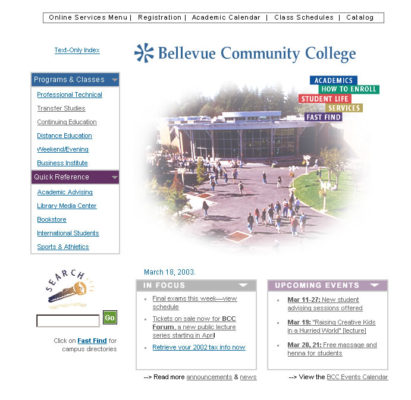
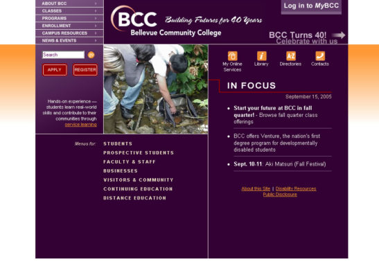
- Over 120 public-facing websites (with over 6,700 web pages) were being managed as static websites without the help of a content management system. This made making global changes impractical, at best, and was cumbersome for content managers to maintain.
- All web applications and web-based services were disconnected from each other.
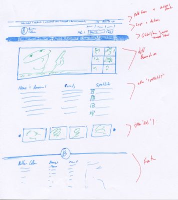
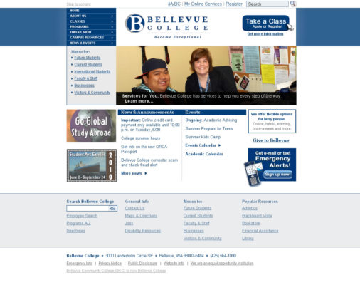
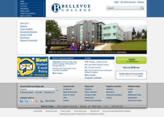
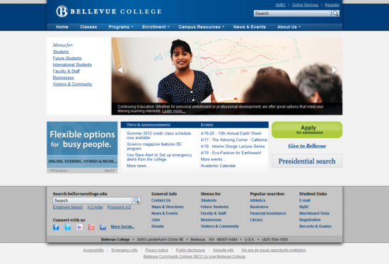
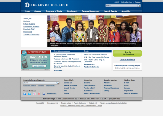
Screenshots
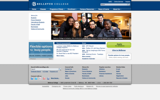
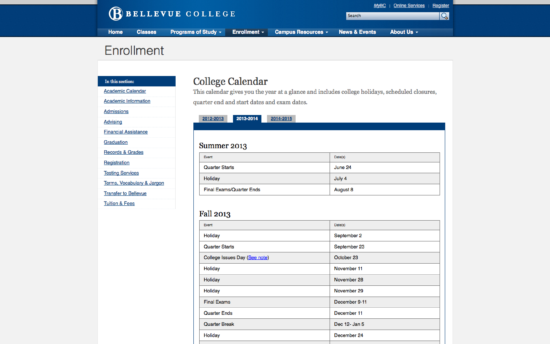
Defining a Purpose
The above statement is simple and straightforward, but complicated because of legal definitions of what is an official legally binding document. The longer version of the purpose is that the college website is the “Online version of the Course Catalog.” By calling it the “online version” it, by definition, is not the exact Course Catalog from a legal perspective, but it is an official document from a procedural perspective. The difference seems subtle, but it allowed the website to house all official information, ensure that people kept it up to date and allowed the website the flexibility to be organized in a way that made the most sense and not be bound by the organization of the printed course catalog.
The explanation may sound a bit silly, but it was cutting edge. This would have not happened without the help of research studies with current students and follow up interviews with academic advisors.
Note, if you look back at why your college/university website was hard to navigate, this issue was likely part of the problem.
Iterative by Design

Improving Navigation
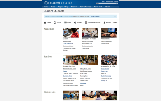
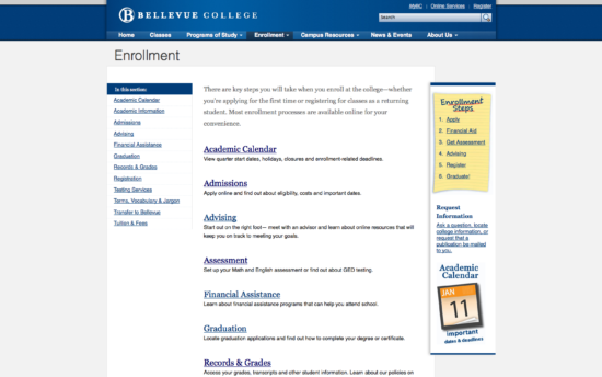
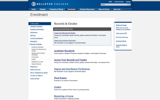
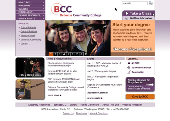
To improve navigation further I worked closely at improving navigation pages (2nd level pages) to better direct people to the content and services they were looking for.
I also worked on improving the footer after noticing patterns of user scrolling behavior. The footer became a place to highlight key pages and resources globally, bypassing other navigation pages and reducing the need to put them ‘on the home page’.
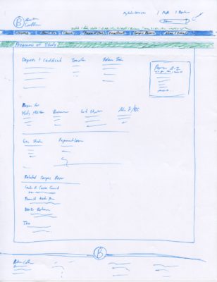
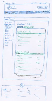
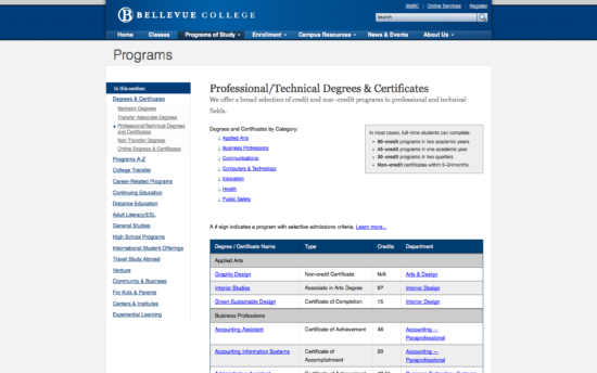
Deeper Information Architecture
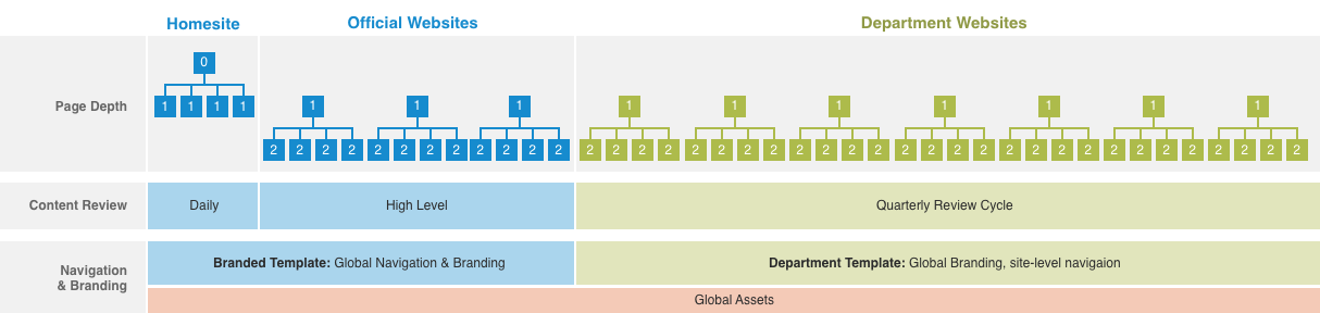
I took the information architecture a bit deeper and broke up the organization of the college web presence into different levels. These levels referred to degrees of control/flexibility relating to branding as well as content curation required for those websites. This architecture also took into consideration global elements and how they are applied to each type of website.
Pattern Library and Style Guides
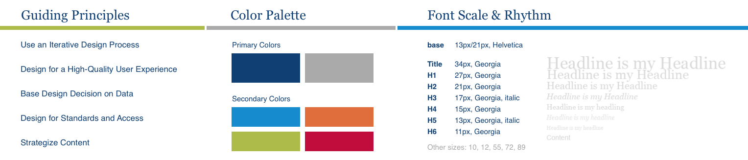
There was also a pattern library created in CSS made from a forked version of bootstrap with added patterns and javascript to suit our needs.
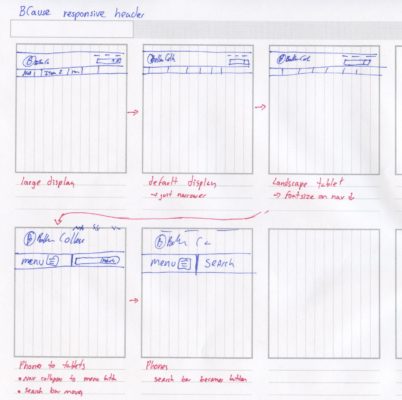
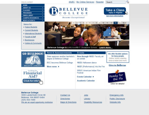
Mobile-First
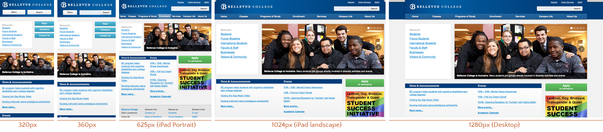
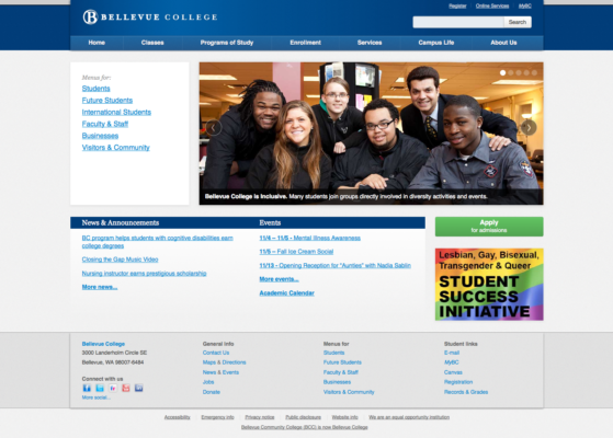
The design for the home page was implemented using concepts from Luke W’s Mobile-First Responsive Design. We began work on a mobile-first approach before most frameworks were supporting this. I took careful consideration in making the design respond based on the content rather than pre-canned breakpoints.
Performance
- Hosting all assets on a cookieless domain, which speeds up download times by using a lean web server, reducing packet sizes, takes advantage of client-side caching, as well as maximizing the number of simultaneous downloads modern web browsers can handle.
- Concatenating and compressing CSS and JS assets to reduce http requests and reduce download speeds.
- Combining icons into sprites to reduce http request.
- Caching web pages to reduce database queries to mostly static content.
- Utilizing leaner web servers, like Nginx, when possible.
To put the performance gains into perspective, the college home page loaded faster when we ported it over to WordPress than it did when it was a static website hosted on IIS servers.
The credit on improving performance goes almost entirely to our systems engineer. My role in this was to encourage him and to continue selling his work as a valuable investment for the organization.
Content Strategy
Content Management
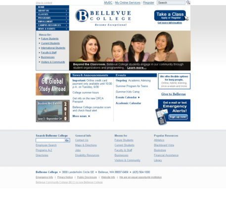
We then built a single custom WordPress theme and a handful of plugins that could handle all official web pages, including the home page. Later on we went through a full migration process of all college websites to this structure.
There were a lot of team members that worked on the theme. I set up the expectations on what I needed the theme to do and handle, I designed the general look and feel of both types of sites. The front end developer (who also had design chops) also helped out on the design of the department site templates and he was the point person for implanting the design. I designed and coded the Bellevue College home page. In addition, I designed and coded all the global elements (see “Globals” below). As far as the migration process. I scoped out the roadmap, but left the college before the migration was complete.
Simplifying Web Addresses
My first major win was by getting the Continuing Education website to migrate from a subdomain to a subdirectory of the college website. Two months after the migration, their search engine rankings went from appearing on the second page of the search results to the 2nd entry on the first page of the search results. After this win, I was able to sell the idea to the entire college.
The flatter organization also helped with printed materials and for creating more granular permission structure to websites once the site was moved to a light-weight content management system.
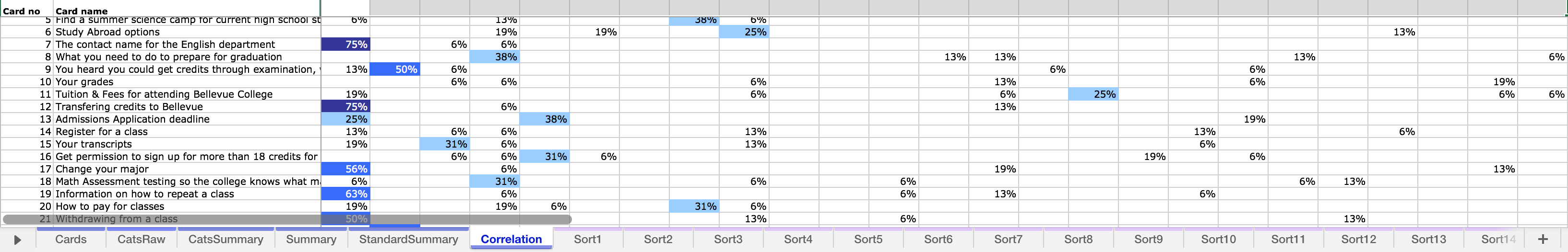
User Research
Web Accessibility
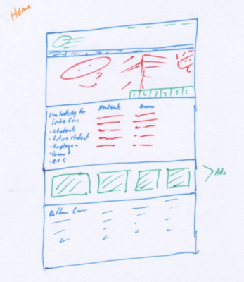
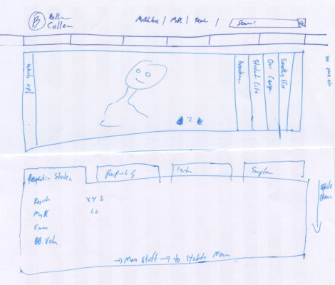
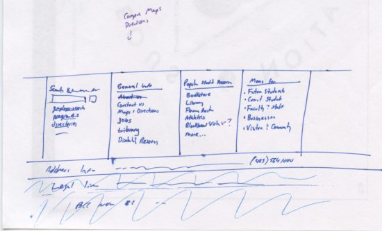
Sketches