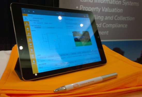
An iPad app used by county assessment personnel to improve the speed and accuracy of field appraisals.
Problem
Depending on the U.S. county, assessment personnel need to physically visit each property once every 3-5 years to assess it for tax purposes. During these field visits, their workflow usually is paper-based and disconnected from the tools they have in their office. Once they get back into their office, they need to make sense of their notes and scribbles, add them to their Computer-Assisted Mass Appraisal (CAMA) software, then assess the taxable value of each property they visited during the day. This process can be error prone and is time consuming.
We felt we were in a good position in the market since we already had tooling that they use and tie into their workflow better.
Solution
We developed an iPad app that allows appraisers to take their data with them while conducting field work and provide them with tools to understand and annotate changes in a parcel which can impact property value. This tool also synchronizes with their CAMA software so they can complete their assessment in the office, which cuts down on redundancy and manual errors.
Screens
Sample of the UI
Sample drawer
Home
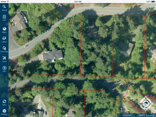
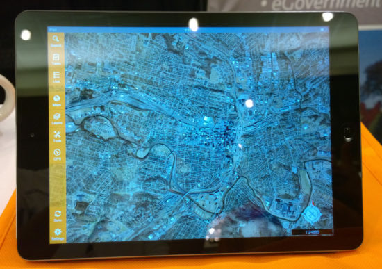
Map Screen
The product launches into a map mode. From this point property assessment personnel can:
Access their to-do list and visualize it on the map to plan their trip.
View area using high quality aerial orthomosaic and oblique photographic imagery.
Visualize assessment Geographic Information System (GIS) data over map.
Measure exterior details such as distances, areas, elevation, elevation gain, and more.
Access information of each property to begin taking notes.
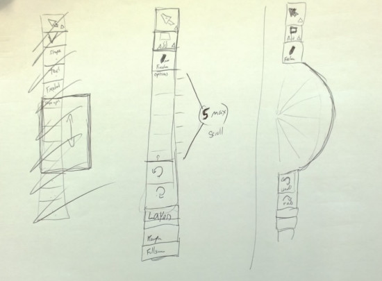
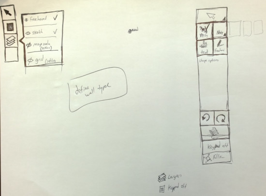
Early mockups
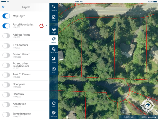
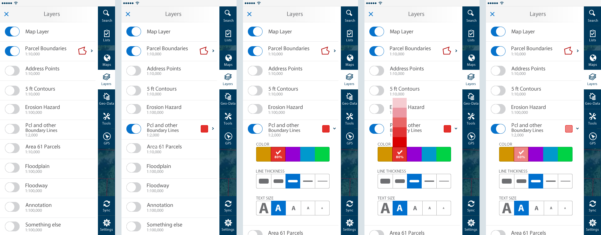
GIS Data Visualization
Using GIS layers, assessment personnel can quickly see how different parcels compare to each other and other details about specific parcels.
Layers interaction
Colors of layers can be tweaked to improve visibility. This was designed to maximize speed by making the interactions fast and reducing the amount of choice.
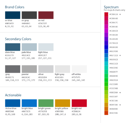
Colors over Map
I extended the style guide to include a spectrum for adding colors over maps. This spectrum plays well with the style guide. I also handpicked 5 colors that were far apart from each other in the spectrum and those were the colors used for layers on top of the map.
Tools
There are a variety of tools available for making measurements and annotations over the map. The tools were designed to make and edit measurements quickly.
Sync
Once assessors go back to the office or have access to WIFI, they can synchronize their information with the CAMA software. There are many scenarios regarding error handling and statuses that needed to be taken into account.
Lists
This area is how property assessment personnel can go directly to their to-do list of properties.
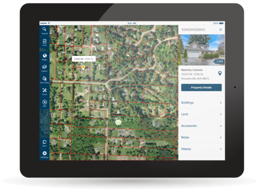
Property Preview
When browsing between properties, assessment personnel can get a preview of each property from the map. They can then choose to go into the property details.
Property Details
The property details section is where property assessment personnel can access all the data about a particular property. This is the primary area where they can document changes to the property that may affect the way the property is assessed for tax purposes.
Early Wireframes
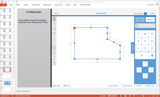
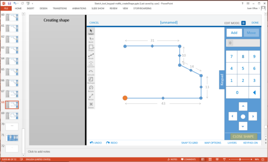
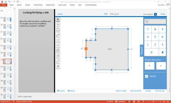
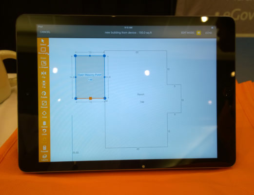
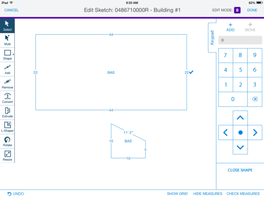
Sketch Tool
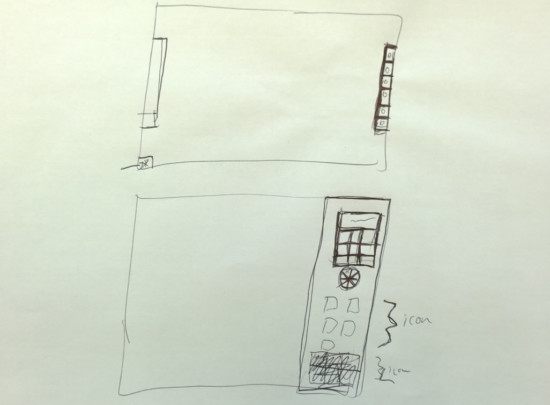
If assessors were to find new structures in the property, they would need to document them. The sketch tool allows them to quickly create diagrams of new structures and annotate them using the encoding they are used to using in their CAMA software.
I spent a good chunk of time and effort working on the interactions of this tool to make sure it was easy and fast to create and edit shapes. My goal was to minimize the number of interactions required to get the job done.
Early Sketches
Early sketches of keypad
Early Sketches
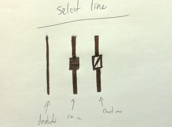
Segment handles on sketch tool
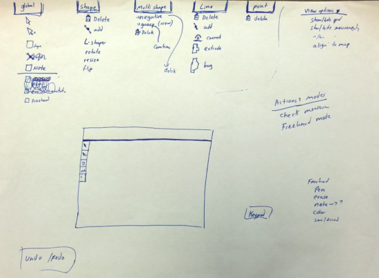
Looking at tool organization
Ideating on sketch tool
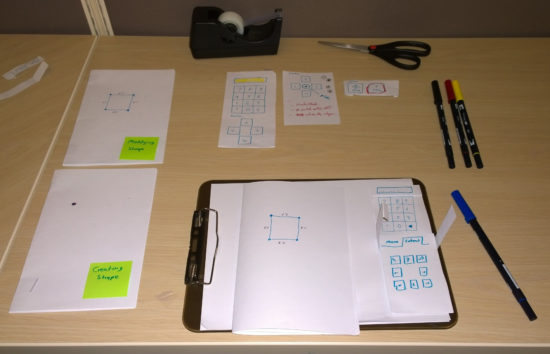
Paper Prototypes
Paper prototyping sketch tool
Close-up of paper prototype
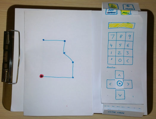
Sample Flow
Walk through of drawing a shape
Walk through of drawing a shape
Editing a shape
My Role
I was the sole product designer for this product. During this process I:
Utilized results from prior field research to better understand how property assessment personnel conduct field visits.
Conducted interviews of county assessors to understand their use of CAMA software at their desks and utilized prior research about the day-in-the-life of a county assessor.
Conducted design sessions with product team, including VP of Mobile, to clarify requirements and brainstorm new ideas for answering perceived needs.
Conducted ad hoc design sessions with other designers and the development team. Since the developers were offshore, these sessions were sometimes held over Google Hangouts.
Developed sketches, wireframes, prototypes of various levels of fidelity during the design process to flush out the flow of the product and the functionality.
Created redlines, style guide and pattern library to document every aspect of the interface to speed up the implementation and ensure design quality of the final product.
Generated final assets (note that many of the icons were done by a different designer, but I took those icons and turned into high quality vectors).
Tools Used
Design methods: findings from prior field research, sketching, whiteboarding, design review, wireframes, paper prototyping.
Communication/collaboration tools: Google Hangouts, Skype, gotoMeeting, Jira, SourceTree
Product Walkthrough
To get a full picture of the product, a product walkthrough was created. This was done through Powerpoint to easily step through each section of the product and annotate design patterns.
Redlines
This product team preferred having detailed redlines. Part of the reason is that we had an offshore app development team and the distance alone could cause some disconnect.
9-slice
Documenting 9-slice images
Mobile Apps and Sunlight
Early versions of the product used more muted color palette, but after testing the product outside, I ended up not only bumping up the contrast of the product but also the font size.
User Studies
With this product, I conducted several user studies with peers from different units to test some of the interaction models, particularly with the sketch tool and the measurement tools.
Prior to starting work in this product, the VP of Mobile had been part of a few field visits at different counties to watch appraisers conduct field work. This information was valuable as we developed use cases for this product.
Collaboration
I worked closely with the VP of Mobile and the off-shore mobile development team in Costa Rica to work on this product. I worked closely with them to work out early sketches, paper prototypes, complex interactions, and work at all stages of fidelity. It was not uncommon to hash out details and interactions over skype and whiteboards to make development decisions on the spot.
White Label
This product was also sold as a white-label solution. The above photos showcase Aumentum Valuation Mobile, which is a customized white-label version of the Mobile Assessment app. For this project, I only provided updated assets to correspond to the color theme of Aumentumns product.
Aumentumn property details
Aumentumn map area
Aumentum sketch tool
Admin Console
The admin console feels like a footnote, and is technically a separate product. This was the system that allowed us to create a translation between Mobile Assessment and various CAMA packages. This is a powerful tool, and could be its own separate portfolio piece. The audience of this tool was tech savvy personnel who usually administer technical systems.
Emergency planning and response platform allows emergency dispatch personnel to navigate the exterior and interior of buildings using a combination of photography and 3D renderings.
A new approach to providing a class schedule and detailed class information that makes it easier for students to find the classes they need as well as plan for future quarters.
Bellevue College is the third largest institution of higher education in the state of Washington and its web presence has more than 120 official websites.